Amo's parents put me in touch with their son Amo which is how we got to design the shop front and branding for Billings which has got a lot of press online.
We have been promising Fresh & Fruity a 'What If' for months, but we have been so busy literally burning the candle at both ends that we keep having to put our pro bono work on hold.
So anyway, here it is. No 14!
This is the before:
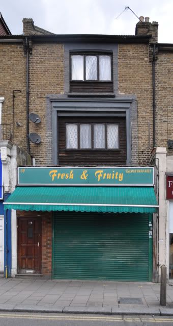
You can view the designs by clicking here: http://whatifsydenham.wordpress.com/201 ... sh-fruity/.
And now i've added them here!
OPTION 1a
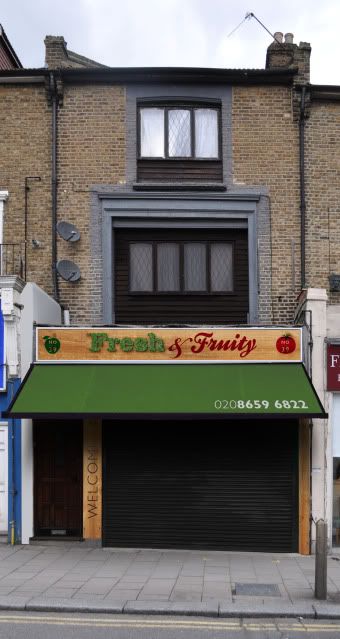
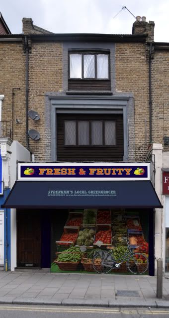
The word ‘Fresh’ is made out of fake grass stick onto raised wooden letters (we looked into making it out of real grass which has been freeze dried or self irrigated, which is possible but it’s £1000!).
We aren’t fans of roller shutters, although in this case it makes complete sense to have one. But why not make it an asset? It is possible to print or paint a roller shutter:
OPTION 1b
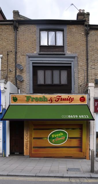
We love old fashioned fruit stickers. They look great. Why not take the personality of these and make them work for a shop front?
OPTION 2a
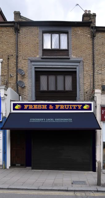
We gave this a different treatment for the roller shutters to make it look like the shop is open with an old bicycle parked outside.
OPTION 2b
So what do you think?
WHAT IF no 14: FRESH & FRUITY UPDATED
Re: WHAT IF no 14: FRESH & FRUITY UPDATED
I'd go for 1a.
Personally I like (& use) Fresh & Fruity - the shop - already. They're friendly, and the produce genuinely is fresh and fruity. I like filling my little bags and popping them on the scales and it always costs less than I would expect!
Why 1a
* Most customers don't take a standing back from the other side of the road when it's closed view. Much as I love 1b with the retro 'orange crate' look, I don't think you need to go that far. 1a with its black shutter down is enough.
* The 2b bike, while evocative, says 'butcher' to me more than fruit and veg, if we're harking back to the 'old' delivery days.
* I realise that the alternative roller blinds are printed, but fear they will be too tempting to the local spraypainters. Realistically, black can be resprayed more cheaply once the local oiks have made their mark overnight than a whole new decal.
* However I do like the vertical 'welcome' a lot. It's organic, and wood, or bamboo, or something, and links nicely with Mervin's healthfood shop a couple of doors down.
Re: WHAT IF no 14: FRESH & FRUITY UPDATED
I really like 1b. Looks crisp and fresh. I do also like the shutter on the last one. I don't know if you could combine the two some how or would it be too busy?
P
P
Re: WHAT IF no 14: FRESH & FRUITY UPDATED
It's 1a for me. Classy and quirky all at the same time.
Re: WHAT IF no 14: FRESH & FRUITY UPDATED
Interesting feedback so far from the blog and here. It's a pretty even split so far.
Re: WHAT IF no 14: FRESH & FRUITY UPDATED
Think all the designs are fantastic. If any of them were implimented it would be great. My favorite is 1a but really like the designs on the shutter with the bike in the last one though. Would really help with advertising when the shops closed & help to make the high street seem nicer in the evenings.
Think the whatifs are brilliant for helping Sydenham. I can see you do all of this for free but hope you are able to continue as think it's one of the things in the area which is really making a difference & getting shop owners and residence involved!
[ Post made via Mobile Device ]
Think the whatifs are brilliant for helping Sydenham. I can see you do all of this for free but hope you are able to continue as think it's one of the things in the area which is really making a difference & getting shop owners and residence involved!
[ Post made via Mobile Device ]
Re: WHAT IF no 14: FRESH & FRUITY UPDATED
Thankyou for your words of encouragement Jonekit (and everyone else who posted here, on the blog, Facebook, Twitter, sent pm's and emails.
The design of shop design and signage is hardly discussed in these forums (as opposed to Virtual Norwood). Every shop owner I have spoken to, some in the last few weeks, have no idea that there are comprehensive guidelines for shop fronts devised by Lewisham Council. For years the Council didn't even know!
The problem with guidelines is that they often don't inspire.
They restrict.
The What If Sydenham project is about showing business owners what they could do. I have had some criticism that we are telling people what to do. This is simply not the case. That's the job for guidelines. Ideally Lewisham would include links to projects like this in their guidelines (hint hint).
Many shop fronts have been changed in Sydenham in the last few years. In most instances they were expensive changes with no real benefit to the business or the high street, sold by 'signage companies' that push products to make profit irrespective of customer need. Paulros ripped out their old shop front and installed a new roller shutter. I estimate they spent between £10-15,000 on that. The temporary sign above their new shopfront cost about £50-70.
They broke local planning laws and are now shut.
All the What If's show what you can do to an existing shopfront. This is cheaper and more sustainable than ripping out current signage and shopfronts.
The What If Sydenham project has been featured across the internet from Brockley to the USA to Latin America, has been featured in articles in Spanish, appeared in local papers and the Guardian, the blog itself has gained over 13,000 hits not including the posts on this forum, although it's not on the Sydenham Society blog list of local links for some reason (we are members). Iv'e received messages from other designers who may do something similar in their area.
Our What If for Billings got them some local press and positive PR not to mention lots of mentions across the internet.
Hopefully this project is showing Sydenham and Sydenham Businesses in a positive light and may help make our high street a nicer place to be.
-
- Posts: 264
- Joined: 8 Oct 2006 10:33
- Location: sydenham
Re: WHAT IF no 14: FRESH & FRUITY UPDATED
It's got to be 1b !!!