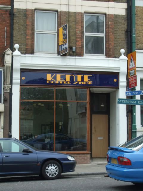
As requested in other posts I have had a look at Kente's sign. Currently Kente looks like this:

It's blue and yellow signage look more appropriate for estate agents sign that sits above the shop.
Look inside Kente and you will find old travel posters like these:

The lights inside have an art deco feel to them.
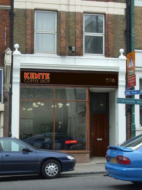
So I've picked up on some of these visual cues with the type. Colours are warm and inviting golds and reds on a roasted brown background which are colours more associated with coffee. Look at coffee packaging and a majority of it uses browns, blacks, reds and golds/yellows.
The sign would be better on wood rather than the shiny plastic background currently used.
Which could look something like this:

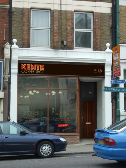
Or this:
 (new image updated, I uploaded the wrong one before) The writing is gold, not yellow.
And whatever you do with you new identity, try to follow it through to things like your menus (clipboards are excellent for menus, and you can run the menus out on your home printer.).

OK, feedback time. I'm sweating a bit on this one!
More what if's can be found here:
www.whatifsydenham.wordpress.com


