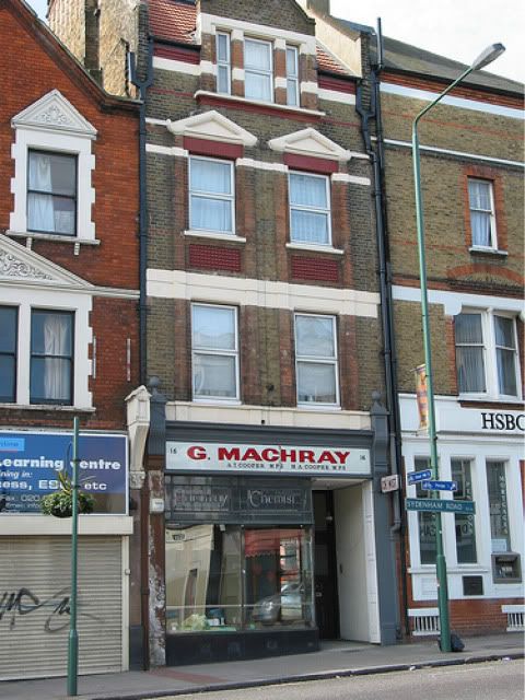
As I heard this shop was owned by someone who already owns three chemists in Sydenham Road,who maybe thought that was enough in Sydenham.But why let someone destroy the front of this lovely shop.On another thought the "bazar" type shop on the opposite side of the road has closed and that has quite an old front to it
The old chemists next to the old HSBC
The real disgrace is that this shop is owned by a current high street trader - someone with every aim to respectability - leading member of the Federation of Small Businesses, member of the health trust etc. What about obeying the law mate?[/quote]
By carrying out work without permission on a listed building like this or in a Conservation area could leave the owner, developer and building contractor liable to prosecution, fines upto the damage that it is worth and possibly imprisonment by Lewisham. This means Lewisham can also require them to restore the building to its state of how it was before work commenced or to mitigate the effects of the damage under a 'listed building enforcement notice'.
As it is in a conservation area if the shop front falls so far into disrepair that it is at risk of being destroyed or unreplaceable Lewisham would then have to serve an 'urgent works notice'. This would enable Lewisham Council themselves to carry out any work which is 'urgently necessary' and then recover the cost from the owner.
I dont see the owner having 'Lattes' to sell if we inform Lewisham of our knowledge regarding the shop or indeed the owner themselves, on a less sinister note im more of a Cappucino man anyway!
We shouldn't really expect the new owners to keep the old name instead of what they wanted to put there.
At least it is another shop being used a?
It is still boarded up Lee, they have kept the mouldings, thankfully, and the signage area, as yet no words, is a very deep blue. I can't remember what colour the surround has been painted...
I like your mock-up. Have you thought of offering your services to local traders or shown any of your ideas to the town hall manager?
I like your mock-up. Have you thought of offering your services to local traders or shown any of your ideas to the town hall manager?
-
sydenhamboy
- Posts: 264
- Joined: 8 Oct 2006 10:33
- Location: sydenham
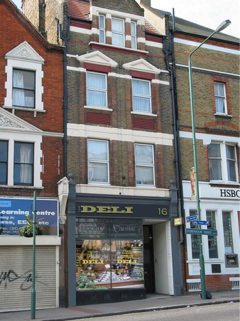
When i seen the picture of 'The Deli' my heart skipped a bit thinking that it actually happened, i do hope it will turn into something like that, or even a good bakery would be nice. It will be an indication that things are on the up. I cant believe big companies arent snapping these places up with all the regeneration about to happen, also its right across from the station.
Hmm, I think we might be onto something here!
The above visual took 40 minutes start to finish.
Combining traditional elements of a shop frontage and making them look contemporary isn't difficult or expensive. The same goes for any signage or shop front.
Bad design is expensive. Not only does it devalue your own business, it has an effect on the whole high street.
Much as I am in favour of the improvements to the high street that are coming (touch wood), replacing the pavements etc wont make a huge difference to the high street unless the traders buck their ideas up. Some places get it spot on such as Sugahill (their sign cost £200!), some spend far much and get it completely wrong such as Smart Chaps, a traditional barbers. Their wooden frontage (while obviously not original) was right for their business, but they replaced it with one that makes them look like a Kebab Shop!
I have no idea what the new owners of the chemists are opening as, although there has been speculation in here about a cafe. If anyone knows who is the owner I'd love to speak to them. Please PM me if you know.
I think it would really smarten the area as a whole by getting Lewisham to replace most of the road name signs, they are looking rather tatty and if changed could really make a perceptable impact for the better, Lewisham need to work on their landscaping.
Also im still not happy with the alledged 'new' Somerfield, a lot more work could be done to make it the definitive location to buy groceries, they havent changed much at all inside nor out.
Also, can we suggest some ideas regarding Station Approach, surely there must be some strong views out there regarding what to do with it regarding its ever important role in the new East London Line - Sydenham.
I completely agree - why do they insist on splashing that vile shade of blue over every piece of signage in the borough? Bromley's dark green signage is much more tasteful.parker wrote:I think it would really smarten the area as a whole by getting Lewisham to replace most of the road name signs, they are looking rather tatty and if changed could really make a perceptable impact for the better

