You can see it and read more about it here:
WHAT IF 21: BARAKAH
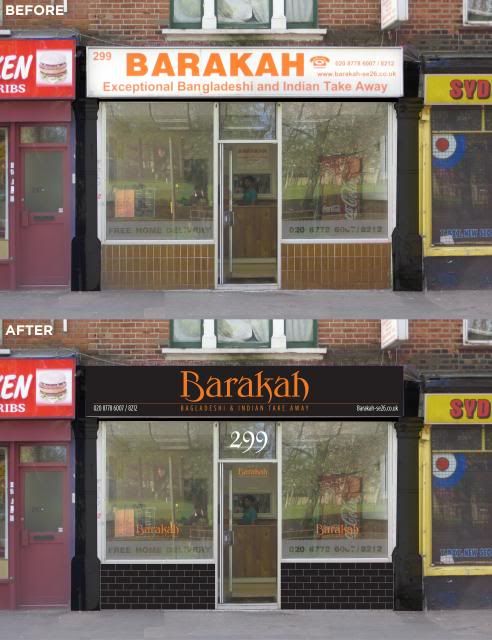
This is the before and after:

We got one of their mailers through the door a long time ago and were seduced by it’s uncoated paper and smart black and orange livery. It felt quality, something rather different to the usual glossy, over complicated rubbish that falls through our letterbox. We kept the menu and when the food turned up we were pleased to note that the quality of the food matched the expectation.
It was some while later when we realised that the place we were ordering from was a 5 minute walk from our front door and looked nothing like any of the marketing material that they were sending out.
So the job here would be simple. Make their shop look like the brand they send out to thousands of homes in the area and make it reflect the surprisingly good quality food that they send out. So we have used their logo and colours.
A bit of black paint, a re-skinned light box in black and orange and some new window vinyls and black brick tiles to tidy up the stall risers can make a huge difference.
Before it looked tired and didn’t match their brand. But What If…
If you haven’t tried them, give them a go: http://www.barakah-se26.co.uk
