Greyhound Competition Entries
-
- Posts: 98
- Joined: 9 Apr 2010 14:52
- Location: Sydenham
Greyhound Competition Entries
Thanks for everyone who has been able to visit the exhibition of entries for the Greyhound Pub Wall Competition displayed in the Gallery at the Kirkdale Bookshop and for leaving comments in the book there. These comments will be considered by the judges when they make their decision on 29th January.
For those of you who are unable to visit the bookshop I have attached a photograph of each entry to allow you to view them and leave your comments here. I will summarise your comments for the judges.
Of course the photographs don't do justice to the entries so it is worth going to have a look if you have time. My apologies to the artists who entered if you feel my photograph doesn't do your work justice. Some of them are really hard to capture in a single photo, and the technology I've used to show the images here seems to dictate the shape and format of the images. If anyone wants to look at all the photos please look at my Greyhound album
http://s875.photobucket.com/albums/ab320/bruceharrison/
Also some of the entries have lengthy design statements which I have only summarised here.
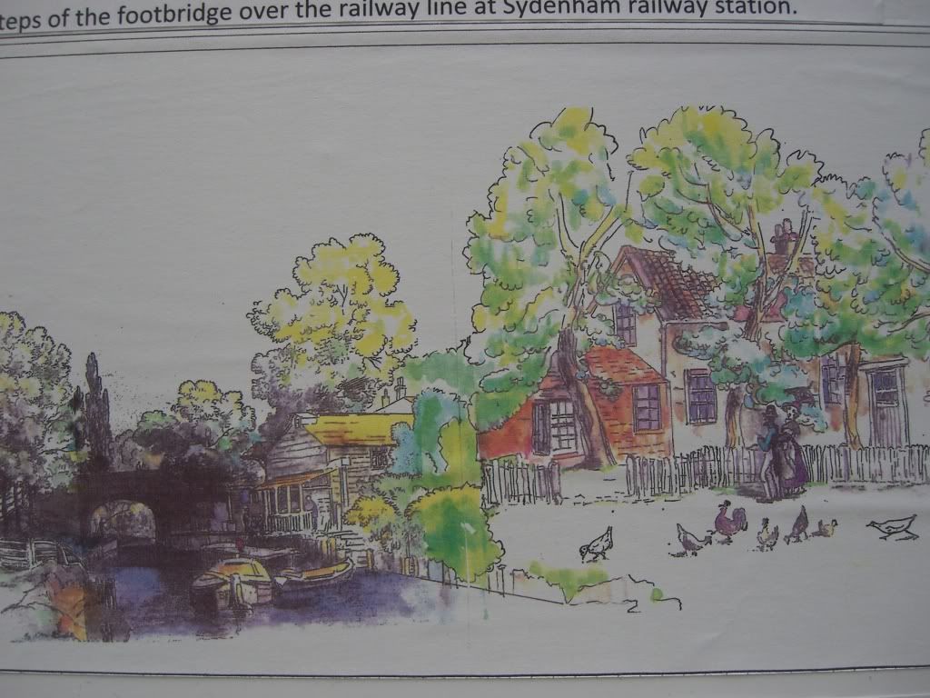
Entry 4
Merges two drawings of Sydenham from the 1830's; one of the canal and the other of the old Greyhound pub. A view roughly from the steps of the footbridge over the railway line at Sydenham station. Constructed in either tiles or fibre-glass reinforced plastic panels.
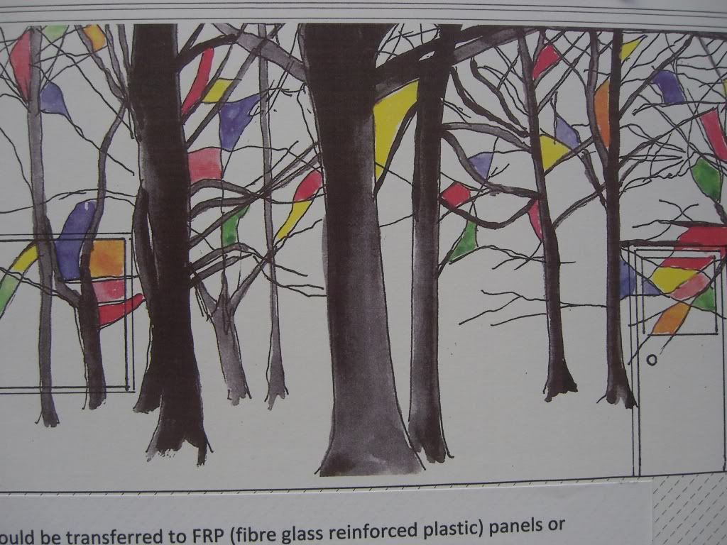
Entry 5
The image celebrates the enduring image of bare-branched trees of the Westwood that covered the area around the Greyhound in the C16, their branches echoing soaring gothic architecture, the coloured panels reminiscent of medieval stained glass. Trees, dressed to celebrate their everlasting beauty. Constructed in either tiles or fibre-glass reinforced plastic panels.
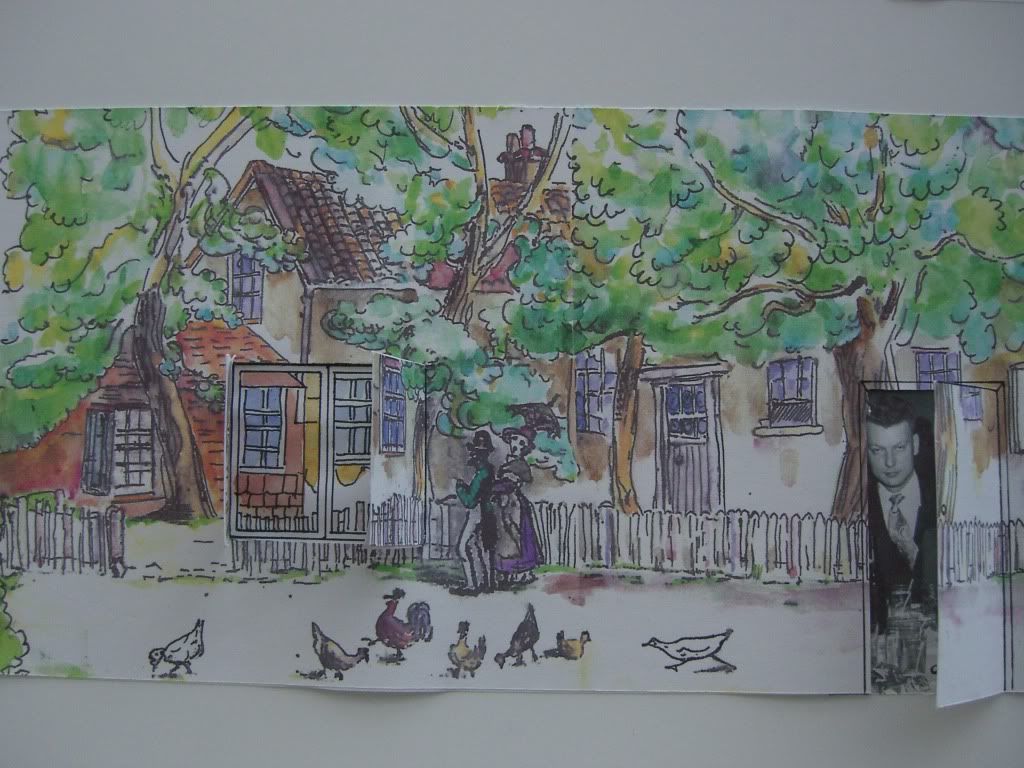
Entry 6
An image of the Greyhound pub drawn in 1839 by G Shepheard showing the old pub, with the entrance, probably originally facing west up to the common, now Westwood Hill. Constructed in either tiles or fibre-glass reinforced plastic panels.
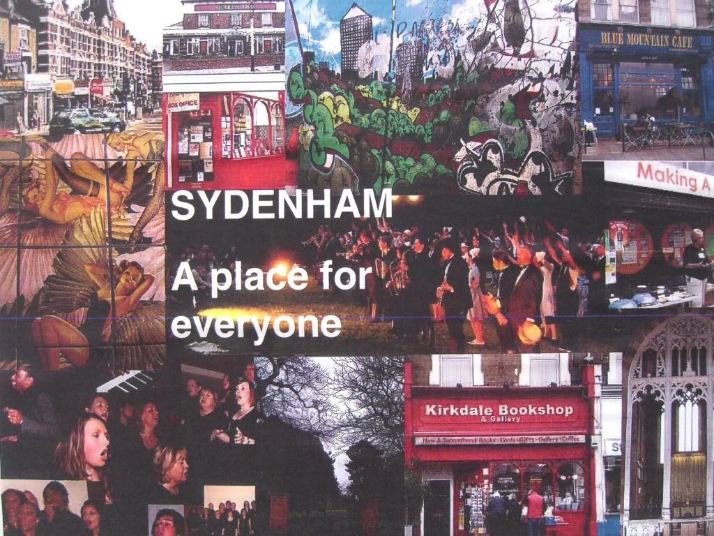
Entry 7
Sydenham - A place for everyone. Photographic images depicting the collaboration of the residents of Sydenham. [NB for any men who don't know the relevance to Sydenham of the "pin-up angels", it seems they are in the ladies lavatory in the Dolphin pub!]. Photographs hand painted onto large ceramic tiles.
Entry 8
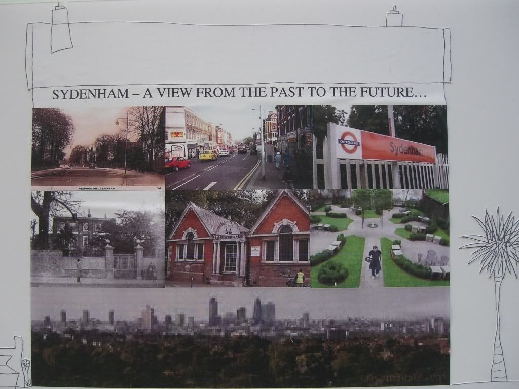
Sydenham - A view from the past to the Future. Images inspired by old to new areas of Sydenham viewed from the overarching scenes seen from Sydenham. Photographs printed onto tiles as a 9 gridded wall.
Entry 9
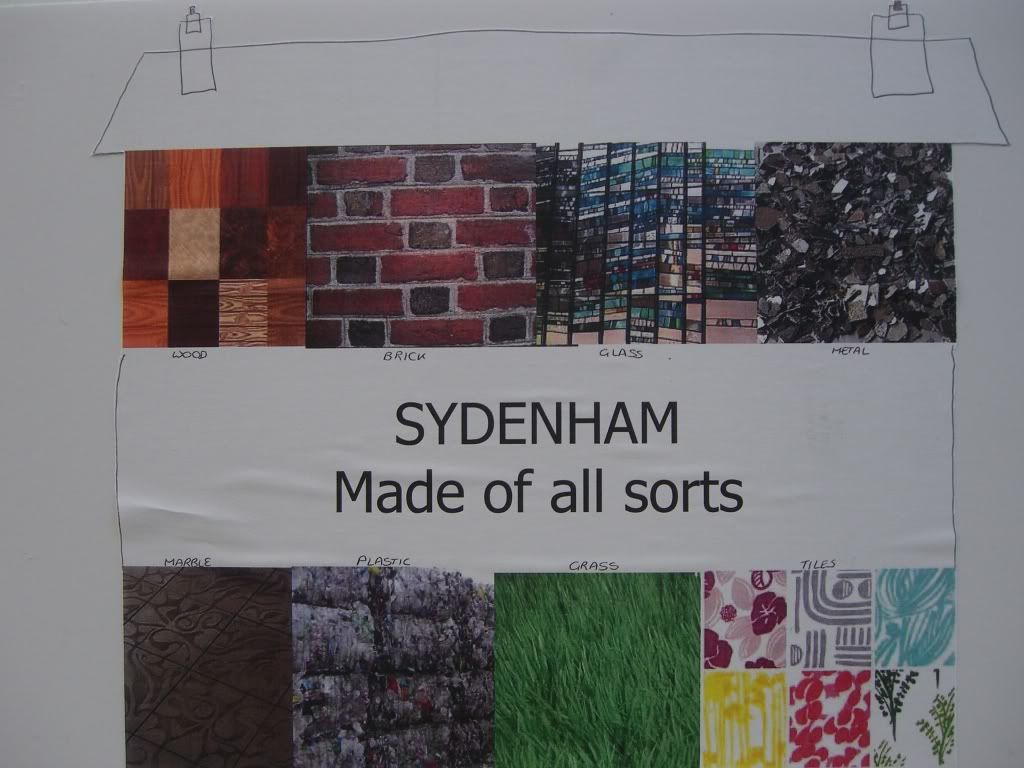
Sydenham - Made of all sorts. A timeless summary of what Sydenham is all about - i.e. all sorts.
Constructed using products to depict Sydenham in 8 grids of material from wood to tiles.
Entry 17
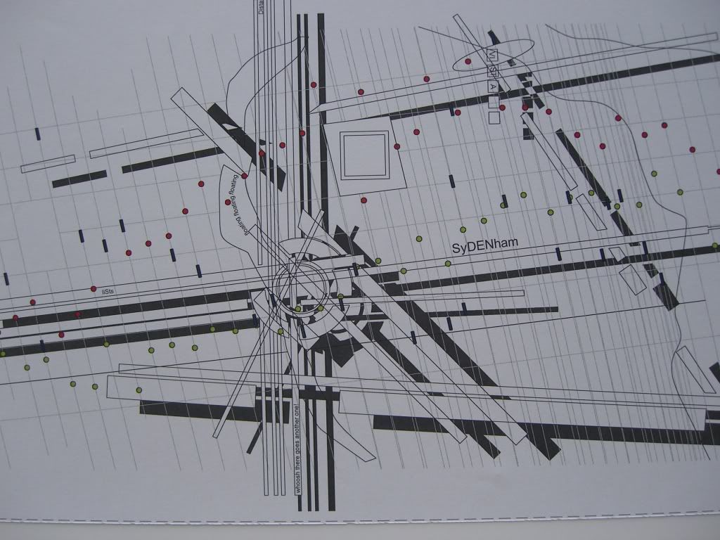
Sydenham as a communications hub. Trains, boats, planes, people. Quite a complex and thoughtful design statement (well worth reading in full at the bookshop). The design also includes temperature and rainfall patterns taken in a garden in Sydenham. The construction should be in relief, incoporpating cement, aluminium and lighting.
Entry 29
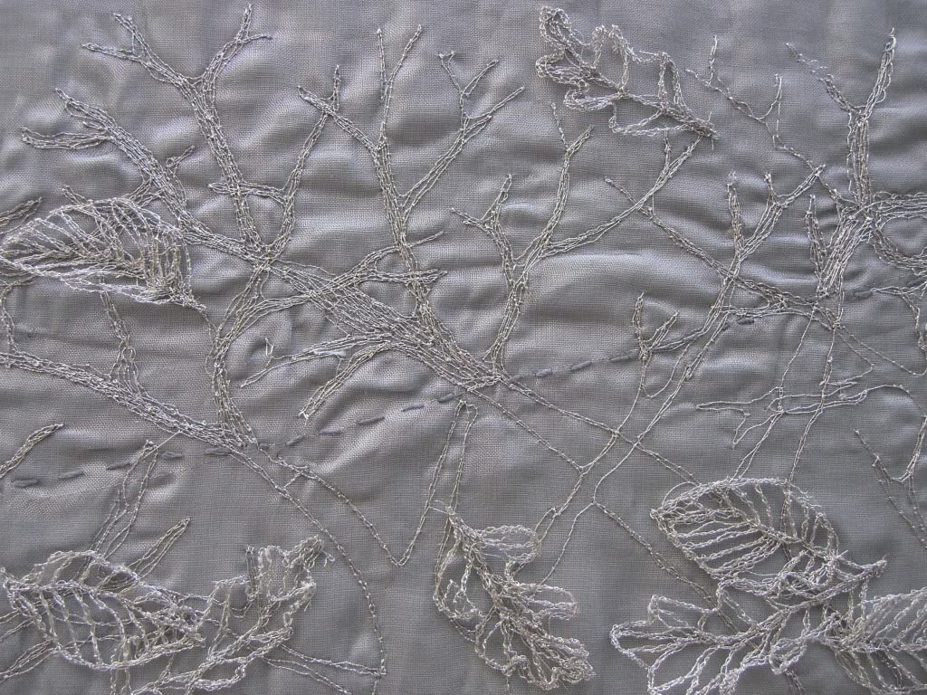
The image takes its inspiration from the long vanished Westwood that once lay beyond the pub site. A forest of oak and hornbeam that was felled for the Deptford shipyards and charcoal.
The original design is worked as machine embroidery. The full scale construction would be in metal mesh and wire, welded and tied. It would also be possible to photographically reproduce the design but the textual properties would be lost.
Entry 47
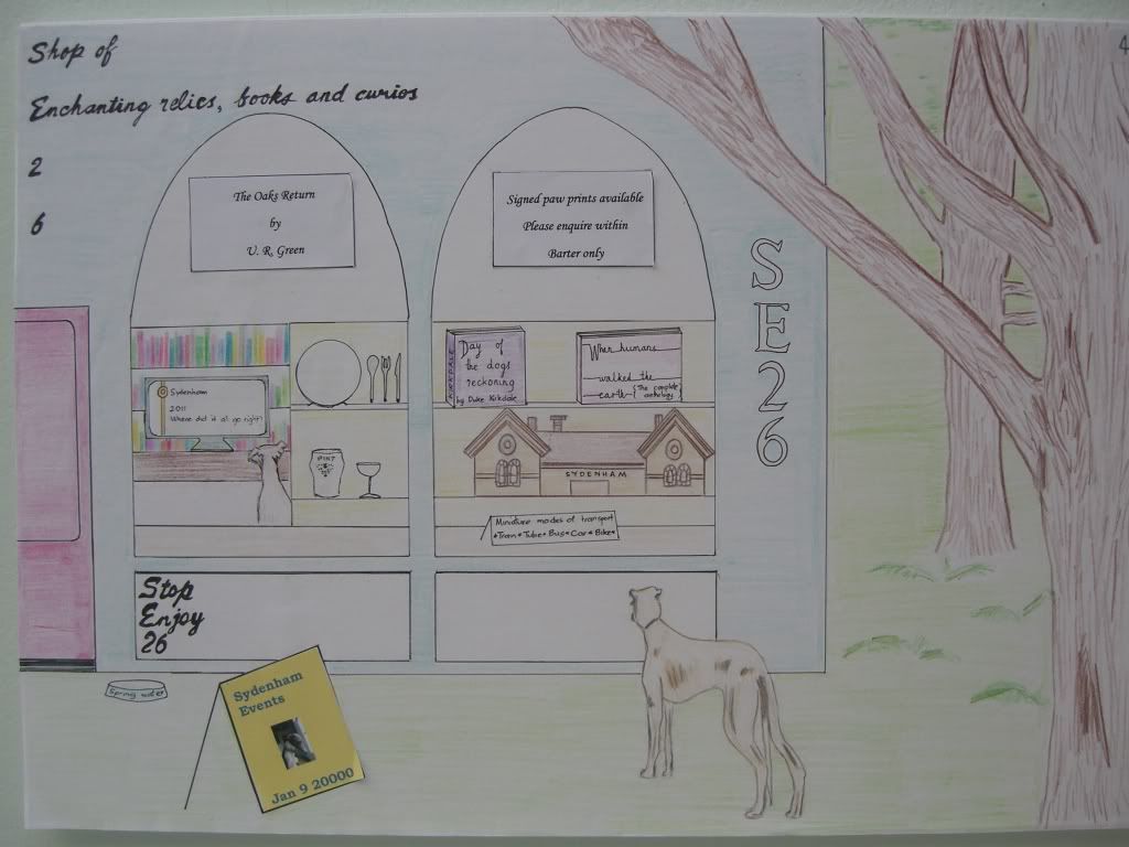
The image celebrates Sydenham - a shop of enchanting relics; Sydenham events; Stop Enjoy. Image to be painted on the wall.
Entry 53
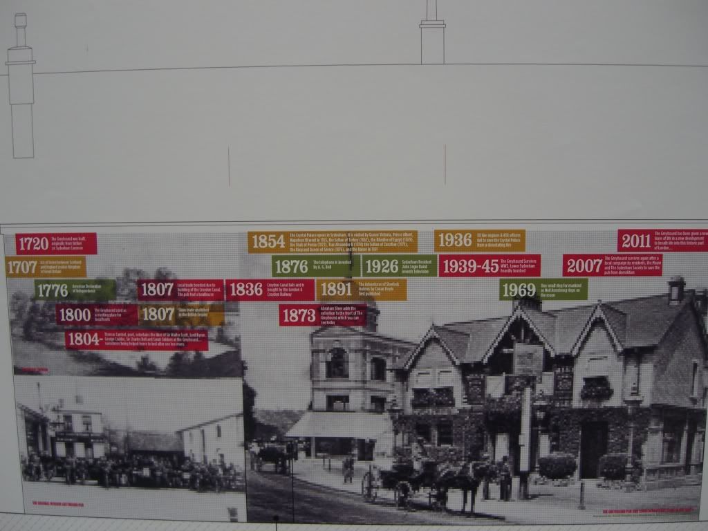
A number of photographic images of the Greyhound from times past with a superimposed time-line showing the Greyhound history in red, British history in orange and world history in green. The construction to be in hardwearing square tiles (same finish as the Oval station).
Entry 59
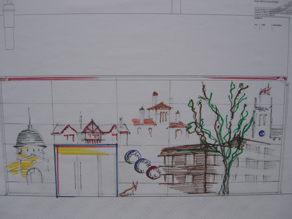
Images of Sydenham as line drawings and colour on enamel panels 1m high similar to enamel panels at Barrington Road, Angel Town and Loughborough Junction SW8 (examples not shown in the photograph but on display at the bookshop).
Entry 60
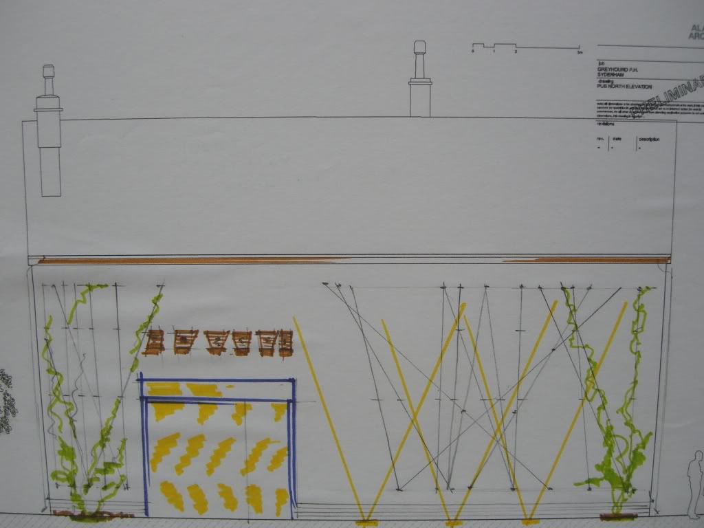
A green wall consisting of random interlacing steel ropes with climbing plants and incorporating nesting boxes. The construction would incorporate pavement uplighters to cast shadows of the plants and wires on the rendered wall.
Entry 61
Images of Sydenham etched onto 15mm toughened glass panels set 75mm away from a rendered wall with pavement uplighters and downlighters from top to cast shadows of the etched images onto the wall.
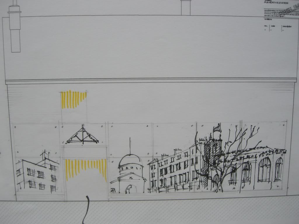
Entry 62
An image celebrating Sydenham - it's water, people, sounds, music, houses, trees and open spaces, it's cultural scene and the community (another long design statement well worth reading at the bookshop). The design will be painted onto the wall with the lower part clad in wooden panels. Stainless steel mirrors will be incorporated into the design to reflect images of people as will the door to reflect an image of "you" as a member of the community.
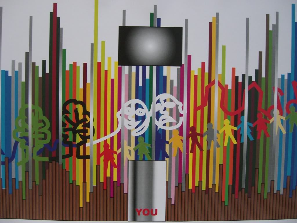
Entry 63
This design incorporates the same images as Entry 62 but they are spread across a white, plastered wall. There are additional repeat images of birds (crows) across the entire design - birds in flight to fill one with a positive expectation. The design is also inspired by graffiti.
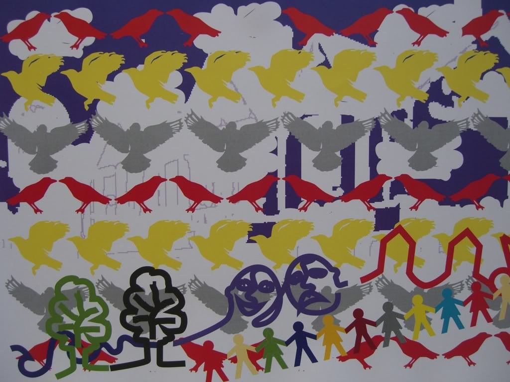
Entry 64
This design incorporates the same images as Entry 62 but made from metal cut and bent to form the images. The metal will be attached approximately 5cm away from the white painted wall.
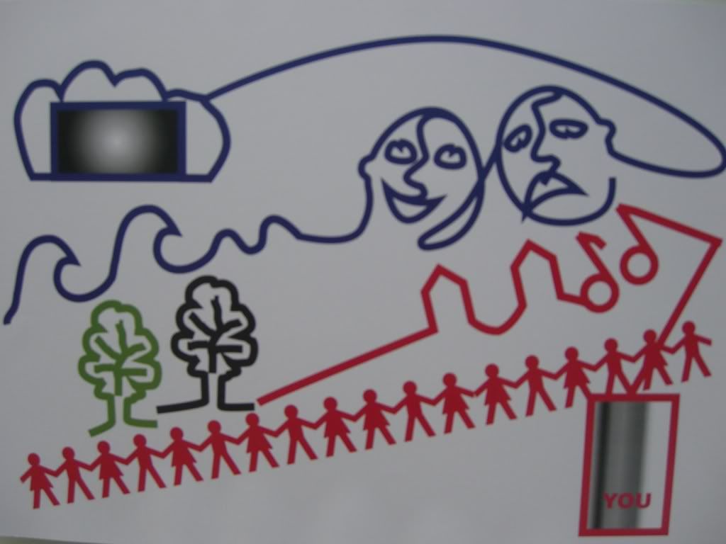
Entry 71
The tree river. The trees represent the wood used for shipbuilding effectively bringing the trees back to Sydenham. The water from Sydenham Wells flows, riverlike, into the tree forms. The construction would be in pant and tiles in different colours to tie in with the tiles in the old Greyhound drinking corridor. (NB the old drinking corridor tiles have been preserved and will be incorporated in the new pub during reconstruction.)
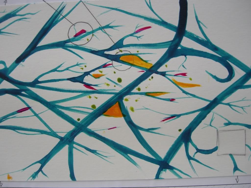
Please refer to the entry numbers when you leave a comment about specific entries. and thanks for taking the time.
Re: Greyhound Competition Entries
Out of all of them I think entry 53 (hope I have the number right!) captures the mood the best - old photos with a timeline of events.
-
- Posts: 3380
- Joined: 9 Sep 2008 07:30
- Location: London SE26
Re: Greyhound Competition Entries
On the basis of the images here, I like 29 and 71. I don't know whether the fact that the mosaic planned for the Naborhood Centre has a 'Sydenham in pictures' themes (but mostly historical rather than contemporary as I understand it) might be an argument for doing something quite different here?
-
- Posts: 8
- Joined: 22 Aug 2010 22:46
- Location: Forest Hill
Re: Greyhound Competition Entries
My vote goes to number 7 and number 47.....both very different but equally strong and original.
Re: Greyhound Competition Entries
I love 17 with its nods to towards construcivism. Looking forward, not back, and celebrating the now!
I would also vote for 47 as its the only design that features an actual greyhound. Really want an image of a greyhound somewhere.
Re: Greyhound Competition Entries
..
Last edited by mummycat on 18 Jul 2011 12:49, edited 1 time in total.
-
- Posts: 49
- Joined: 18 May 2010 18:56
- Location: Sydenham, SE26
Re: Greyhound Competition Entries
Out of these three, I would like to see: N4, N47 or N53
Good luck!
With regards,
Love-Sydenham
Good luck!
With regards,
Love-Sydenham
Re: Greyhound Competition Entries
I particularly like:
17 - Modern, a 'statement', unique, engaging (you keep going back to explore the artwork) and timeless.
53 - I can really picture this on that space. Interesting and engaging with the timeline. Perhaps will be dated in a few years though.
60 - Different, interesting and green. As the wall is in a secluded area I think this one fills the space well. Concerns regarding the cost of maintenance though.
61 - An inspired idea to cast shadows through etched glass makes this an interesting piece. Looks stylish and timeless. As above as this wall is in a secluded area, such lighting will really enhance the new square. Concerns regarding energy consumption though if powerful lights are required to make it work.
Gaz
-
- Posts: 44
- Joined: 8 Jun 2006 13:52
- Location: Sydenham
Re: Greyhound Competition Entries
I like 59 and 61
-
- Posts: 98
- Joined: 9 Apr 2010 14:52
- Location: Sydenham
Re: Greyhound Competition Entries
Thanks for all the comments so far.
There are still a couple of days to comment on your favourite / least favourite entries to try to influence the judging panel before they meet to try to make a decision this Saturday.
-
- Posts: 500
- Joined: 4 Jan 2011 19:54
- Location: Upper Syd
Re: Greyhound Competition Entries
I really like #29 and the idea of it being realised in metal is lovely, like the Queen Mo's Gates.
There's something ever so basic combined with technical about oxydised/anodised/coloured wrought metal and its not being solid (as in being see-through) makes it not overbearing .
/
There's something ever so basic combined with technical about oxydised/anodised/coloured wrought metal and its not being solid (as in being see-through) makes it not overbearing .
/
Re: Greyhound Competition Entries
I like the ideas contained in No. 29. 71 is also a contender for me
-
- Posts: 98
- Joined: 9 Apr 2010 14:52
- Location: Sydenham
Re: Greyhound Competition Entries
Thank you for all your great comments, here and at the Kirkdale Bookshop where all the entries will remain for a short while.
On Saturday the judging panel met and decided not to choose any of the entries submitted for the competition.
Some of the entries were liked very much by some of the judges but there was no single entry that ticked all the boxes for all of the judges.
As a result of this it has been decided to extend the competition, probably until the end of February, or maybe into March.
This will certainly help all those who found they had insufficient time to prepare their entry during the busy Christmas and New Year period.
There will be changes to the competition brief to clarify what is required and there will be a financial prize for the winning entry.
As soon as these details are finalised they will be made available on-line. In the meantime if you are interested in entering the competition please email your name, address and phone number to greyhoundpubwalldesign@hotmail.co.uk
On behalf of the organisers I would like to thank everyone who has been involved or shown an interest in the competition so far.
Re: Greyhound Competition Entries
What's happening with this - has a design been chosen, yet?