WHAT IF MUSTIS PART DEUX

The place for serious discussion, announcements and breaking news about Sydenham
leenewham
Posts: 5886
Joined: 2 Sep 2007 11:58
Location: SYDENHAM
Contact:

WHAT IF MUSTIS PART DEUX

Post by leenewham »

It's been a while since we did one of these. Currently we are doing one for the Crystal Palace Cinema which is a difficult one.

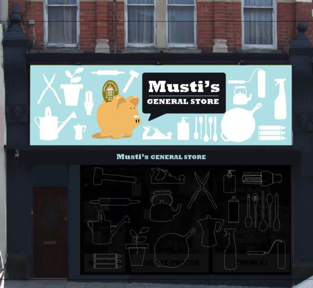
Anyway, back to Musti's. This is a sketch (the shapes and pig need refining but you get the idea) for Mustis new sign now that he has his new shop front.

We we able to go inside the shop before it was renovated and it had the original ceiling roses from the original light fittings above the false ceiling (really beautiful mouldings) and the original wooden floor that started in the middle of the front window where the original door would have been. unfortunately the floor is now concreted over. It would have been great to have revealed the original features in the refit but hopefully they are untouched and safely covered by a new false ceiling.

We have looked at Musti's before and it generated some interest (it's how we got to meet the man himself, and what a nice guy he turned out to be).

So here is the latest...complete with pig.

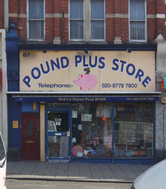
BEFORE
Image

WHAT IF:
Image

So what do you think? Should Musti change his sign? Does Bensonby still prefer the old one?

His shop opens soon...

More on the blog
http://whatifsydenham.wordpress.com/200 ... part-deux/

ORIGINAL MUSTI'S WHAT IF THREAD:
http://alturl.com/ruav
Cheese Wotsits
Posts: 35
Joined: 6 Jun 2008 17:35
Location: sydenham

Post by Cheese Wotsits »

Please Musti, do this!

I like the friendly look you've given it, just like the service you can get there. The pig looks rather good now. The products pattern looks great and I particularly like the fact that you included them in the roller shutters making the most of them even when closed!

:D
Juwlz
Posts: 749
Joined: 26 Oct 2005 20:49
Location: Outer Sydenham

Post by Juwlz »

LOVE IT. The best 'what if' yet.
leenewham
Posts: 5886
Joined: 2 Sep 2007 11:58
Location: SYDENHAM
Contact:

Post by leenewham »

Thanks...:-)

I remember last time you said 'keep the pig' Juwlz so this one is for you ;-)

If business owners would use these forums to involve at least SOME of their customers in how they want their high street to look we may get somewhere.
Trawlerman
Posts: 318
Joined: 17 Sep 2009 13:56
Location: Sydenham

Post by Trawlerman »

Mustis looks good. Porker looks good.
bensonby
Posts: 1656
Joined: 18 Jun 2008 12:28
Location: Kent

Re: WHAT IF MUSTIS PART DEUX

Post by bensonby »

leenewham wrote:Does Bensonby still prefer the old one?
Have I expressed a liking for that sign in the past then?
leenewham
Posts: 5886
Joined: 2 Sep 2007 11:58
Location: SYDENHAM
Contact:

Post by leenewham »

Yep...in the original post with the previous design you said: can I be controversial and say that I prefer the original?

(aside from the fact it needs a lick of paint)


Nothing wrong with that of course Bensonby, thing is, do you prefer the new one?
oin
Posts: 69
Joined: 31 Mar 2005 10:48
Location: Sydenham

Post by oin »

I like the new one Lee. Good job yet again.
Ronski
Posts: 437
Joined: 6 Jan 2006 01:19
Location: SE26

Post by Ronski »

Nice job Lee.

I like the new sign 100%, ties in well to the old one. Maybe the shutters (I assume they are) on the windows are a bit dark. Doesn't look too expensive to make though & smart. I can imagine the sign backlit but guess that depends on their budget?
leenewham
Posts: 5886
Joined: 2 Sep 2007 11:58
Location: SYDENHAM
Contact:

Post by leenewham »

I'm not a fan of backlit signs. They are expensive to install, run and generally look awful, especially when they get first behind them. Look at the signs in the high street like the nail bars and chicken places.

Strangely so it seems, simpler signage is actually cheaper. It costs money to install a new shop front, install roller shutters and to cover up original features etc. IT makes no sense to me why people changed all this in the first place but ho hum...

Problem with this sign is that it is so large. I'd be inclined to replace the boards and get it painted or cut in vinyl.

If I had my way with an unlimited budget i'd get all the shopfront replaced (that are non original) with the same wooden shopfront with the same facia boards above with pull out canopies. All signs would be raised lettering or hand painted using traditional materials and techniques. Look at Colombia Road or some of the streets around Brick lane where they have done this, it looks fantastic.

You can but dream...in an ideal world...

Sigh...
tulip1
Posts: 44
Joined: 12 Nov 2008 20:43
Location: Sydenham

Post by tulip1 »

Love it! Love the piggy, Lee. It must be kept. Mustis - are you keeping an eye on this thread? :)

While discussing shop signs - have you seen the temporary shop front for "Heavenly Presents" Gift shop where the bus stop is up Sydenham Road? It's lovely and looks smart beside the "Desire" shop. Like it. Sharpens/smartens up that little corner of Sydders Road.
leenewham
Posts: 5886
Joined: 2 Sep 2007 11:58
Location: SYDENHAM
Contact:

Post by leenewham »

Ah Tulip, have they updated it? I didn't like the sign they had a while ago. If you are interested here is the what if we did when it was still known as Lady Metros.

http://whatifsydenham.wordpress.com/200 ... -gift-box/
poppy
Posts: 574
Joined: 1 Sep 2007 20:03
Location: Sydenham

Post by poppy »

It looks great Lee.

It made me chuckle actually. Like the speech bubble!

I must say I hate shutters with a passion, and only feel slightly happier when shops use the coloured ones or the semi-shutter type, but this looks great.

Like the retro products! Anyway it could be a semi one though? Love the colour. Also would be good if the front door next to it could be included in the scheme by painting it the same or a complementary colour.

I also think Kente could benefit from this, if they go with your 'what if' proposal for them, that door it shares a doorway with could look a lot better. (Sorry, I am very particular about small details).
Marathon
Posts: 391
Joined: 26 Sep 2008 15:00
Location: Lewes, East Sussex

Post by Marathon »

Nice!
Annie
Posts: 1187
Joined: 13 May 2006 11:08
Location: Sydenham

Post by Annie »

:o Love Mustis :o

I hope he realises how much we love his shop being in our highstreet.
Love the potential sign Lee :D
leenewham
Posts: 5886
Joined: 2 Sep 2007 11:58
Location: SYDENHAM
Contact:

Post by leenewham »

He does Anne.

When I was talking to him someone stopped their care to say they missed him.

The shop behind the false ceiling has the original plaster mouldings. It's rather beautiful.

The sign is actually from before Musti took over the shop, another reason why he should change it, aside from the fact that people seem to refer to him by name.

He should be open soon. Hopefully a new sign will follow.
Ulysses
Posts: 893
Joined: 1 Apr 2009 12:30
Location: Sydenham

Post by Ulysses »

Posted on wrong thread...DELETED. :oops:
goonerchamp
Posts: 167
Joined: 28 Jun 2005 12:18
Location: Sydenham, Sydenham where the f**k is Sydenham

Post by goonerchamp »

Just spoke to Musti

He is planning on opening in two weeks and as lee says plans to change the sign in due course - at present this is beyond his budget

I for one will be happy to have the shop back
Newbie
Posts: 9
Joined: 1 Nov 2008 11:10
Location: SE26

Post by Newbie »

Would be better if the pig is removed, the sign looks extremely cheap (old and new) - sorry! Like the rest of the design.
Cheese Wotsits
Posts: 35
Joined: 6 Jun 2008 17:35
Location: sydenham

Post by Cheese Wotsits »

It's a pound shop, not Harrods!

Keep the pig.
Post Reply