WHAT IF: no2 MUSTI'S
The idea of these what if's is to show what even a little bit of design can do. I set myself an hour max to do each one and will do one version at least with the same shop front.
So this is Musti's turn.
I loved Musti's.
I'm really looking forward to them reopening. But why oh why, as everyone calls it Musti's, was the shop named the pound plus store? I always kept going in the wrong store!
So what if:
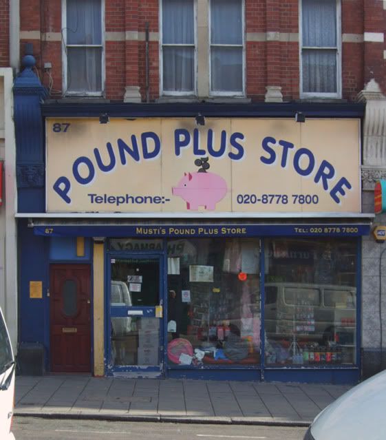
Becomes
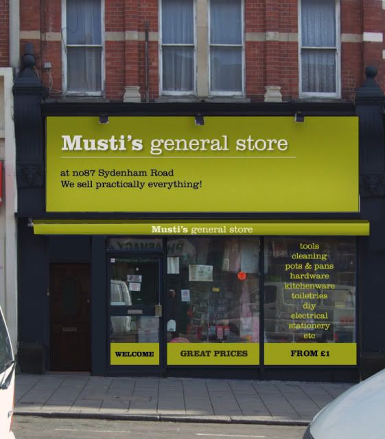
The work on this includes painting the metal work and surround a really dark blue, a new awning and simple new signage on a flat painted (not plastic) wooden background. The shopfront is unchanged and I haven't changed what is in the window display (they are still smoke damaged goods in the visual!).
One last thing, if the large sign was removed, I'm sure you would find the original signage underneath. With a little more investment and possibly new shopfront it could be really special and a real local treasure.
http://whatifsydenham.wordpress.com/
Hi Lee
I like your ideas for syd rd....
Re Mustis [ or as my children always called it...'The Piggy shop!!] , dont forget that he displays a lot of stock outside the shop so most of the window writing would be out of view while he is open.
I love Mustis too, i used to go there for my insense even when i moved out of the area!! as he was the only place that had the ones i liked and he also used to get some in for me whenever i asked for a particular type, i cant wait for him to open again!
I think this transformation is indicating that the shop could look far more tasteful if all the crappy plastic boxes werent outside it, i think that was partly why it looked cheap and this shows how shops can remain selling pretty much the same goods but from a desireable looking shop in a clean cut, trendy, tasteful looking high street consequently due to a change of the shops frontage.leaf wrote:dont forget that he displays a lot of stock outside the shop so most of the window writing would be out of view while he is open.
Lee! You have a fantastic vision for Sydenham, you seem to be hitting the nail on the head with ALL of your ideas, if only the stupid KENTE people could have listened to 'what if:1'. I hope the owner of Musti's sees this, it would definetely be what the majority of us want in Sydenham and make people who pass through Sydenham think the area is up-and-coming, just like shops Sugahill and the Blue Mountain do.
The sort of shop that displays goods outside is the kind that has stock piled up to the ceiling inside, what makes shops like that good is that they have everything u need/want and more!,I think this transformation is indicating that the shop could look far more tasteful if all the crappy plastic boxes werent outside it, i think that was partly why it looked cheap and this shows how shops can remain selling pretty much the same goods but from a desireable looking shop in a clean cut, trendy, tasteful looking high street consequently due to a change of the shops frontage.
if they didnt display stock outside and up to the rafters they couldnt possibly have everything in stock, if you go into a shop like that just before closing time you will see all the stock from outside ..inside! with hardly any space to move about...its the way shops like that work.
Please lets not change absolutely everything in the name of progress!
You say it makes it look cheap...YES it does..it IS cheap! thats why they do so well!
Love the fresh signage Lee, but Parker lets not try to make a silk purse out of a pigs ear!
KEEP THE PIG!!
The lack of 'taste' in Sydenham is part of Sydenham's big image problem, i.e. why the high street looks scruffy and dated, maybe its because of shops looking tasteless that we are all on here complaining about Sydenham's image. Well i know i am!
Btw, who on earth buys all those crappy plastic boxes anyway, it would probably be progress to get rid of such tat.
Starting with small shops like this can make the ultimate perception of a high street change for the better, in terms of my vision for Sydenham nothing couldnt be too tasteful!!
Surely we want to attract people with taste, people with money!! Not pound shops, they look tacky, what Lee has done here is show that cheap items can be sold in shops which look nice and inviting, cheap shops shouldnt have to look cheap and primitive!
Btw the pig is a bit irrelevant to the main name Musti isnt it?!
-
- Posts: 264
- Joined: 8 Oct 2006 10:33
- Location: sydenham
I think musti's is a brilliant store! - whatever random item I've ever needed - they have always had. And they are nice in there.
But it looks sh*t. Embarrassingly so. Really depressing with a really unfunny 'comical' pig/moneybox logo thing that looks like it's been designed by a primary school kid.
You should offer your design services to the shops in Sydenham, Lee. Seriously. It would make SUCH a difference. There's a real 80s feel about the place which I find depressing. The shop keepers don't seem to have the imagination to improve the image of their shops. I appreciate cost is involved but alot of time we're talking about painting, more modern fonts and some lighting or something. We should collectively write to some of the stores and tell them what we think on the Forum. Or we could print off Lee's ideas in colour and distribute them to the owners as a leaflet or something. It's like telling someone they have bad breath or they have a 'visible bogey' issue going on. It's hard but you'll be thanked in the long run!
I did do a sign with a pig on it, but for the purposes of this excercise I didn't use it. I might post it later.
If the vast majority of people recognize the pig and don't call it Mustis, then he should definitely keep it. If that isn't the case he should loose it.
Currently I think the high street shops look too disparate and I agree with Parker, it looks a mess. Signage works best when it's simple. They an still have character and be different from one another.