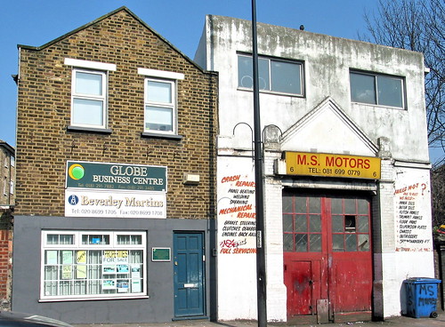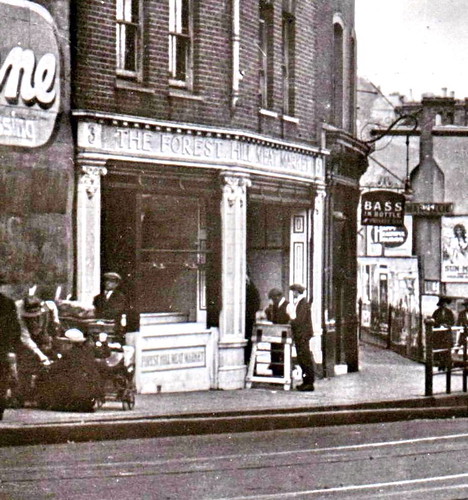
Opposite Forest Hill station, how much is still standing?
-
Steve Grindlay
- Posts: 606
- Joined: 4 Oct 2004 05:07
- Location: Upper Sydenham
The first photograph was taken just before the London County Council extended the tramline from London Road and under the bridge to Brockley and Catford in about 1914. The corner was originally too sharp for trams to get round. No.2 (Cullen's) and 4 London Road were demolished and replaced by what is now the launderette.
At the extreme right of the picture is the wall of the Hob. Maps show that the meat market and building to the left of it were not entirely demolished; the shopfronts were set back and rebuilt. From Eastmans to the corner was, however, completely rebuilt.
The newly built (in 1912) L&SW Bank (now Barclays) is at the extreme left of the picture.
leaf is right about the second picture, but it is interesting to see how the buildings have changed:

-
Blushingsnail
- Posts: 73
- Joined: 20 Jul 2006 10:38
- Location: Forest Hill
I've been meaning to post this query for some time and have finally got round to taking photos of the building in question, so here goes:
The frontage of 3-5 Devonshire(?) Road opposite FH station has very decorate stonework and building numbers. The letters 'HI' are also visible between the two shop fronts (fish & chip shop and the shoe repairer) and I assume the letters originally formed part of the words 'Forest Hill'. Does anyone (ie Steve!) know what this building originally looked like and what the stone wording on the front would have said?
http://www.flickr.com/photos/23352191@N02/2232845706/
(This is the first time I've tried linking to an image and it hasn't worked, so I've provided the url to Flickr instead.)
-
Steve Grindlay
- Posts: 606
- Joined: 4 Oct 2004 05:07
- Location: Upper Sydenham
Blushingsnail, this picture should explain:

It was "The Forest Hill Meat Market" which occupied 3-5 Devonshire Road from about 1915 to the early 1920s.
I've uploaded the complete image <here>

It was "The Forest Hill Meat Market" which occupied 3-5 Devonshire Road from about 1915 to the early 1920s.
I've uploaded the complete image <here>
-
Blushingsnail
- Posts: 73
- Joined: 20 Jul 2006 10:38
- Location: Forest Hill
Comparing the before and after shots, the before looks great. We keep hearing people on these threads saying 'leave the small businesses alone, they can't afford to make their shops look nice'.
Well, if they could make a warehouse look nice years ago, why cant they make the same building look nice today?
It's not difficult...if anything it should be cheaper. Have a well considered painted sign (those perspex illuminated boxes are expensive to run, expensive to buy and INCREDIBLY ugly), get rid of the tat that no-one reads and get rid of the clutter . Make sure the signage is sympathetic to the building. Don't paint brick, it will cost more in the long run! Or if you do, keep in in good condition.
Sydenham high street could look great with a bit of thought no matter what the shop sells.
Anyway, great pictures Falkor, if you have any more like that please send them to me as when I get time I'm preparing something on the high street you may be interested in.
